2024 Colour Trends: How to Use the Year’s Hottest Colours in Your Home
Colour trends are always changing, so it can sometimes be hard to keep up. But whether you’re refreshing a single room or revamping your entire home, understanding these trends will help a lot!
Use inspiration to decide what you like and what you don’t like (both of which can be useful), and make informed colour decisions that you’ll love for years to come.
Below, I explore the key colour trends for 2024 and provide practical tips on how to incorporate them into your home. For any painting needs, I’d recommend that you visit a specialist painting supplier for a comprehensive selection of paints and accessories, as they generally have a wider array of colours to choose from, and can offer additional help and advice that general stores can’t.
1. Earthy tones
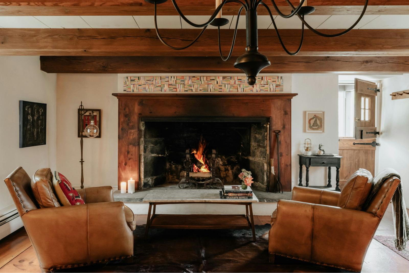
Earthy tones have been popular for a few years now, replacing the popularity of grey that was a trend for so many years. Colours such as terracotta, deep greens, and warm browns are perfect for creating a grounded and serene atmosphere. Plus these hues can work exceptionally well in living rooms and bedrooms, where relaxation and comfort are a super important factor.
How to use earthy tones:
For the living room, you can paint one wall a beautiful deep green. Add some neutral furniture to create a sophisticated and cosy environment.
In a bedroom, terracotta can work wonderfully. Use it as an accent colour in your bedding and accessories to add a touch of warmth but without overwhelming the space. Greens and browns go well with terracotta.
Earth tones can also be applied through your accessories. Cushions, rugs, curtains and other decorative items can subtly introduce a natural colour.

2. Soft pastels
Pastels are my absolute favourite, particularly when it comes to using colour in your home. Blush pink, mint green and powder blue are expected to dominate interiors in 2024 and through to 2025. These colours bring a sense of tranquility and lightness, making them ideal for smaller spaces or areas where you want to create a calm, airy feel.
How to use soft pastels:
In your kitchen, bold mint green cabinets or a pastel backsplash can refresh the space while also creating a modern feel.
Pastels can work best in a bathroom, providing a beautiful clean finish that also gives an impression of space. Consider blush pink tiles or powder blue walls. Mix pastels to give a young, vibrant feel. Look how beautifully this classic bathroom adds a modern touch through the use of colour. I love the duck-egg blue tiles combined with the pink bath:

For a children’s bedroom, you can absolutely consider pastel colours. It gives a bit of a softer feel than bright, vibrant colours (meaning they may sleep better!), but also adds a touch of playfulness that’s ideal for a kids’ room.
3. Bold and Bright
For those who love to make a statement, bold and bright colours like vibrant yellow, cobalt blue and fiery red are perfect choices. These colours add energy and dynamism to any space, making them ideal for areas that see a lot of activity.
How to use bold and bright colours:
Create a warm and inviting first impression as soon as guests come into your home with a bright entryway. Bold walls or even painted doors can make visitors feel welcome as soon as they step inside.
For a living room, use bold colours in your furniture, like your sofa and surround it with more muted tones to really make it stand out. I love the colour of this sofa when compared to the slightly lighter pink of the walls.

In a dining room, consider brightly coloured fabric tub chairs that will make the space pop. Don’t feel like you need to use the same colour for every chair either – have one in blue, one red, one pink, one purple, etc.
4. Neutral shades
Neutral shades such as beige, grey and off-white continue to be popular due to their versatility and timeless appeal. These colours serve as a perfect backdrop, allowing other design elements to shine.
How to use neutral shades:
For a living room, a neutral colour palette can make the room feel bigger and lighter, which is always a win-win. If you want to add colour, do this through your accessories.
Neutral colours work best in a bedroom, to create a calm retreat where you can retire at the end of a long day.

Neutrals can work really well in a kitchen too. As much as I love a green or blue kitchen, a neutral one will remain timeless for many years to come, and provide a contemporary feel.
5. Jewel tones
Rich jewel tones like emerald green, sapphire blue and amethyst purple are perfect for creating a sense of luxury and sophistication. Plus there’s the added benefit that these colours work well in both traditional and contemporary settings.
How to use jewel tones:
In the living room, you can subtly introduce jewel colours through your sofa or cushions. If you’re feeling bold, then feel free to paint the walls a lovely vibrant colour too.
For your bedroom, introduce touches of jewel tones in your bedding, or paint an accent wall. Just remember you do need to sleep in here, so perhaps avoid maximalist interiors. The jewel tones in this bedroom are really subtle but work well (and would work better with some colourful curtains):

Practical tips for incorporating colour trends
Now I’ve given you some specific colour ideas, how can you actually apply these in your home?
Start small
This is always key. If you’re not sure whether you’re going to like a colour, don’t paint every wall in a room – you might hate it! Start with small accents, like cushions, rugs and artwork.
Balance your colours
Balance is really important when it comes to colour. Balance bold colours with some neutrals to avoid creating an overly busy space.
Consider your lighting
You should always consider the natural and artificial lighting in a room before choosing a colour. Some colours may look different under various lighting conditions, so test paint samples on your walls and observe them at different times of the day.
Use colour psychology
Colour psychology really does work, and studies have shown that certain colours evoke particular feelings and emotions. Fast-food chains use red because it makes people feel hungry!
Think about the mood you want to create in each room. Calming blues and greens are ideal for bedrooms and bathrooms, while energising yellows and oranges can work well in kitchens and home offices.
Use complementary colours
A colour wheel is going to be your friend when choosing colours to use in your home. It helps you understand which work well together, which enhance each other and which perfectly clash. This technique can help create a harmonious and aesthetically pleasing look.
Shopping for paint at Chadwicks
When you’re ready to bring these colour trends into your home, Chadwicks is your go-to destination for premium paints and supplies. Chadwicks offers premium paints, from vibrant and bold hues to soft and calming pastels, ensuring you find the perfect match for your home improvement projects.