How to choose the perfect wallpaper
Wallpaper is one of the most transformative design elements you can introduce into a home.
It has the ability to shape atmosphere, soften or define architectural features, and bring depth and character in a way that paint alone often can’t. Yet with such a vast choice of colours, patterns, textures and materials available, knowing where to begin can feel daunting.
Choosing the perfect wallpaper is less about following trends and more about understanding your space, the light and the feeling you want to create.

Below, I will break down everything step-by-step, from understanding your space to selecting the right material so you can confidently choose wallpaper that looks beautiful and works for your home long-term. Plus, you can read this guide on what not to do!
Start with the feeling you want to create
The most successful interiors start with mood rather than colour. Wallpaper has a powerful influence on how a room feels, whether calm and restful, warm and cocooning, or bold and expressive. Soft, low-contrast tones create calm and relaxation, while bold designs with stronger contrast add energy and visual impact.
For bedrooms, you might want to choose more calming colours, subtle designs and minimal contrast to provide a peaceful room for sleeping in.

For living rooms, dining rooms and hallways, you can definitely go a bit bolder and include layered patterns, texture and statement prints. Don’t be afraid to use colour or drama here. For home offices, it’s all about a space that allows you to focus. Think about balanced and uncluttered patterns.
Then, understand how wallpaper interacts with space
Wallpaper can subtly alter how a room is perceived. In smaller spaces, lighter tones and more delicate patterns can help create a sense of openness, preventing the room from feeling enclosed.
Larger rooms often benefit from deeper colour and more confident pattern, which adds warmth and stops the space from feeling sparse.
Pattern direction also plays a role, as vertical movement can draw the eye upward and make ceilings feel higher, while horizontal emphasis can visually widen narrower rooms.
These small but mighty visual signals are part of what makes wallpaper such a powerful design tool.
Next, think about the light carefully
Natural and artificial light both influence how wallpaper appears throughout the day. In darker rooms, lighter shades and softly reflective finishes can help lift the space and enhance brightness. In well-lit rooms, deeper tones or more muted finishes can create balance and prevent the space from feeling washed out.
I’d recommend that you always view wallpaper samples in situ, at different times of day, to understand how colour and contrast behave in your own environment rather than relying solely on how they appear in a showroom or online. If you’re wallpapering more one wall in the same room, use two different samples on the different walls to compare how the light affects the look.
Then, find the right pattern and scale
Pattern is often what first draws people to wallpaper, but scale is just as important as design.
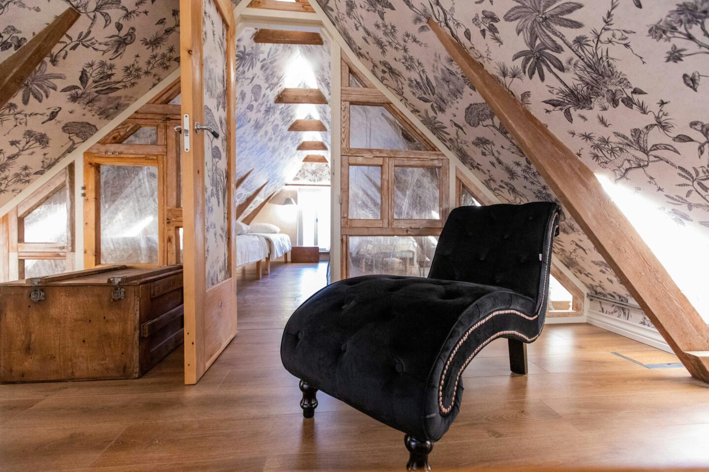
Large-scale patterns make a bold statement and work particularly well in spacious rooms, where they have room to breathe and can create a real sense of drama. Smaller, more intricate designs are ideal for compact spaces or areas where you want a quieter, more subtle backdrop.
To find the right combination for your room, start by considering the size and purpose of the space. In smaller rooms, delicate patterns or repeated motifs prevent the wallpaper from feeling overwhelming, while in larger rooms, bigger prints add personality and anchor the space.
Next, test samples on the wall, as seeing the pattern at full scale makes a huge difference compared to swatches or photos. Hold the sample at different distances: stand close to appreciate the detail, then step back to see how it reads across the room.
Also think about how the pattern interacts with your furnishings. A bold print works best when paired with more neutral or coordinated elements, while a subtle pattern can complement a room full of textures and colour.
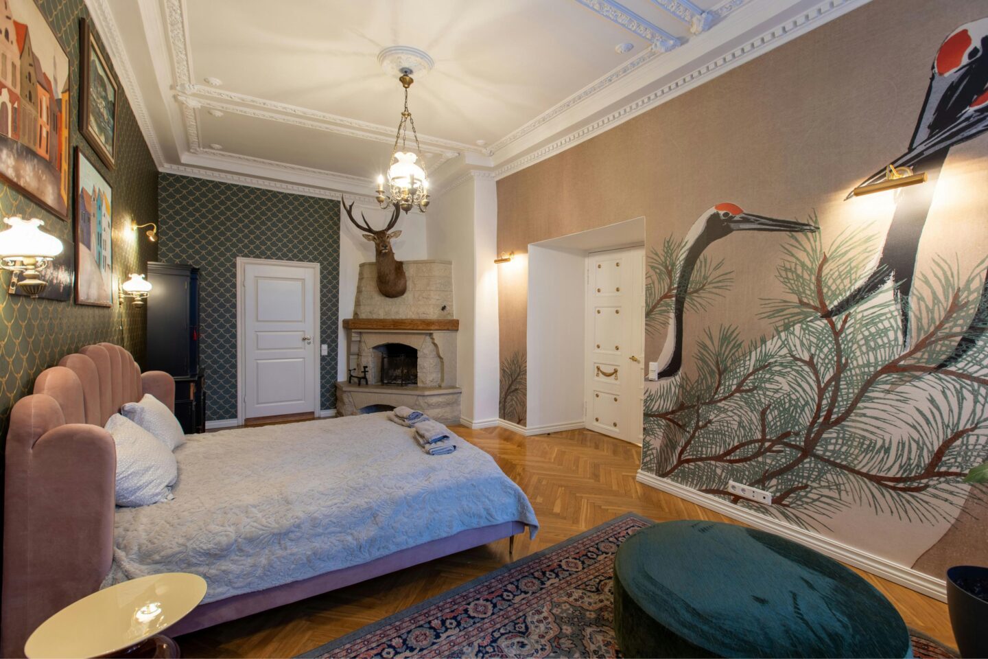
I love how the bedroom above uses a delicate patterned wallpaper behind the bed, but then has a completely different wall mural that’s bold on the other. It works because of the contract between the small pattern and the large one.
Why is the texture and finish of wallpaper so important?
Texture and finish can completely change how wallpaper feels within a space, often in ways that are more subtle than colour or pattern. Even understated textures can add depth, softness and visual interest, helping a room feel more layered and considered rather than flat. Finishes such as gentle embossing, fabric-inspired surfaces or natural weaves introduce tactility and warmth, allowing the wallpaper to enhance the room without relying on bold design.
The finish you choose also influences how light interacts with the surface. Matte textures tend to create a softer, more relaxed atmosphere, while slightly reflective finishes can bring brightness and definition. Many people use texture as a way to improve a scheme and add a luxe feel, opting for luxury wallpapers for a more curated finish that adds sophistication without overwhelming the space. When used properly, texture can make all the difference to a space.
How do you choose the right wallpaper material?
The material of the wallpaper isn’t something people always consider. They usually go for pattern first, which is understandable.
But material can be important depending on the room that the paper is going in. A bathroom or kitchen could benefit more from a durable, washable finish that doesn’t mind a bit of moisture. More delicate materials can be used for bedrooms, or other low-traffic areas, like home offices.
Ultimately, the right material is one that suits both your lifestyle and the environment of the room, ensuring your wallpaper not only looks beautiful but continues to perform well over time. If you’re unsure, it’s always a good idea to get a sample of the wallpaper before you commit to a purchase. Colours can shift significantly depending on light, surroundings and scale, and what feels perfect in theory may feel very different on your wall.
Should I go for a feature wall, or cover the whole room?
This ultimately depends on the atmosphere you want to create and how confident you feel using pattern. A feature wall is often the safer choice, allowing you to introduce colour, texture or a bold design without overwhelming the space. It works particularly well with larger-scale patterns, statement prints and beautiful wall murals, giving the eye a clear focal point while keeping the rest of the room balanced and calm.

Covering all four walls, however, creates a far more immersive and cohesive feel. When the pattern, tone and scale are well chosen, a fully wallpapered room can feel enveloping, considered and luxurious rather than busy. This approach tends to suit softer, more tonal designs or smaller-scale patterns that add depth without dominating the space.
If you are unsure, consider the size of the room, the strength of the pattern and how much visual impact you want. A bold design in a small space may work best as a feature, while a subtle, textural wallpaper can often be used throughout the entire room to beautiful effect.