

White and gold themed office (with moodboard)
A bright, stylish workspace can make such a difference to how you feel when you sit down to work.
If you’re thinking about refreshing your home office, this white-and-gold moodboard is a great place to start. The palette is clean, uplifting and easy to build on, whether your office is a tiny corner or a full spare room.
It’s simple, it’s elegant, and it instantly makes a space feel more put-together.

1. White desk | Robert Dyas | £85 | 2. White and gold lamp | Maisons du Monde | £32.39 | 3. White and gold chair | Home Square | $148 (half price) | 4. Magazine rack | Wayfair | £35.99 | 5. Marble book ends | Made.com | £20 | 6. Copper wire bin | Oliver Bonas | £29 | 7. Kate Spade notebooks | Trouva.com | £12.95 | 8. White bookcase | Wayfair | £163.99 |
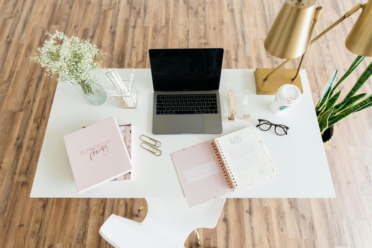
This mix of clean whites, warm metallics and subtle textures creates a look that’s elegant but not over the top. The marble, gold accents and simple shapes all work beautifully together, especially if you’re going for that dreamy Pinterest office vibe.
Why white and gold works so well in a home office
White and gold is one of those timeless combos that instantly lifts a room. The white keeps your space feeling open and bright, while the gold adds just enough personality to stop things looking clinical. It’s ideal if you want something stylish but not too trend-led.
A few reasons this palette is such a winner:
1. It looks clean and modern
If your office tends to gather paperwork (don’t we all?), white furniture creates a sense of calm even when real life is happening around you. The gold details break it up and add warmth.
2. It suits small spaces
White reflects light around the room, so even a tiny home office won’t feel boxed in. Gold accents add visual interest without overwhelming the space.
3. It pairs beautifully with colour
Whether you’re drawn to navy (more on that in a moment), blush pink, emerald green or even warm neutrals, white and gold are the perfect foundation.
How to add texture to a white and gold office
To stop everything looking too flat, try mixing in a few different materials:
- Marble – for bookends, coasters or even a small side table. It adds that little hit of luxury.
- Velvet – a velvet chair in cream or navy looks gorgeous against gold accents.
- Brushed brass – slightly softer than polished gold and lovely on lamps, handles or plant pots.
- Natural fibres – a jute rug or woven basket stops the space feeling too formal.

Textures really do the heavy lifting in a minimal colour scheme, helping it feel warm rather than stark.
Thinking About Going for a Bold Wall Colour?
I’m starting to renovate my own home office. It has flooring but that’s it. I’m still undecided as to what colour to go for. You can see in this post that I want to get creative with colour. I love navy walls at the moment, like this one from Love Chic Living:

It’s stunning with the white bookshelf in the corner and the white frames of the artwork above the fireplace. Jen has a big window which means the room doesn’t look too dark. My office has one small window in the corner of the room. I’d be afraid of making the room look too small, dingy and dark.
Navy + white + gold
Navy brings richness, depth and sophistication, while the white and gold stop everything feeling heavy.
If you’re considering a similar look, here are a few things that help dark walls work in smaller or darker rooms:
- Choose one feature wall rather than painting all four
- Add plenty of white through shelving, frames and storage
- Use mirrors to bounce available light around
- Add warm lighting, especially desk lamps, floor lamps or under-shelf LEDs
- Keep the clutter to a minimum, so the space still feels open
Even a small office can look incredible with the right balance of dark and light.

Do moodboards actually help?
I definitely think so. Moodboards are one of the easiest ways to figure out what you’re drawn to before you start buying things. Seeing colours, textures and furniture next to each other helps you spot what works and what clashes. They’re also great for avoiding those “oh no, why did I buy that?” moments.
I created the white-and-gold moodboard with navy in mind, but you could easily swap the wall colour for sage green, terracotta or warm grey and get a completely different feel.
I think navy blue, white and gold are a stunning combination. I made the white and gold-themed office moodboard thinking that navy walls would just look stunning with it. There’s nothing better than a moodboard to give you some great ideas for any room!
Have you ever gone with a daring wall colour? Did it work, or did you hate it? Let me know to help me make my decision!


